A website design is like a store. Do you want it to be messy and confusing, or neat and inviting? That is where landing pages come in. Online stores have campaign pages, kind of like the front windows of a real store. These pages are designed to catch your eye, keep you on the website, and start your shopping experience.
What is a campaign page?
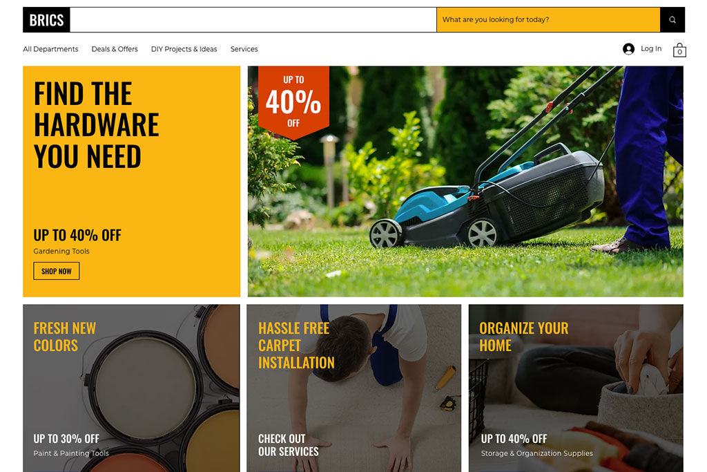
A campaign page is like a promotional webpage for marketing. It is where you end up when you click a link, like from a Google ad or an email offer. These pages have one main goal – for e-commerce, it is to make people buy products.
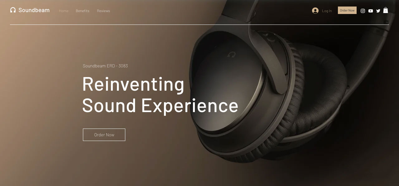
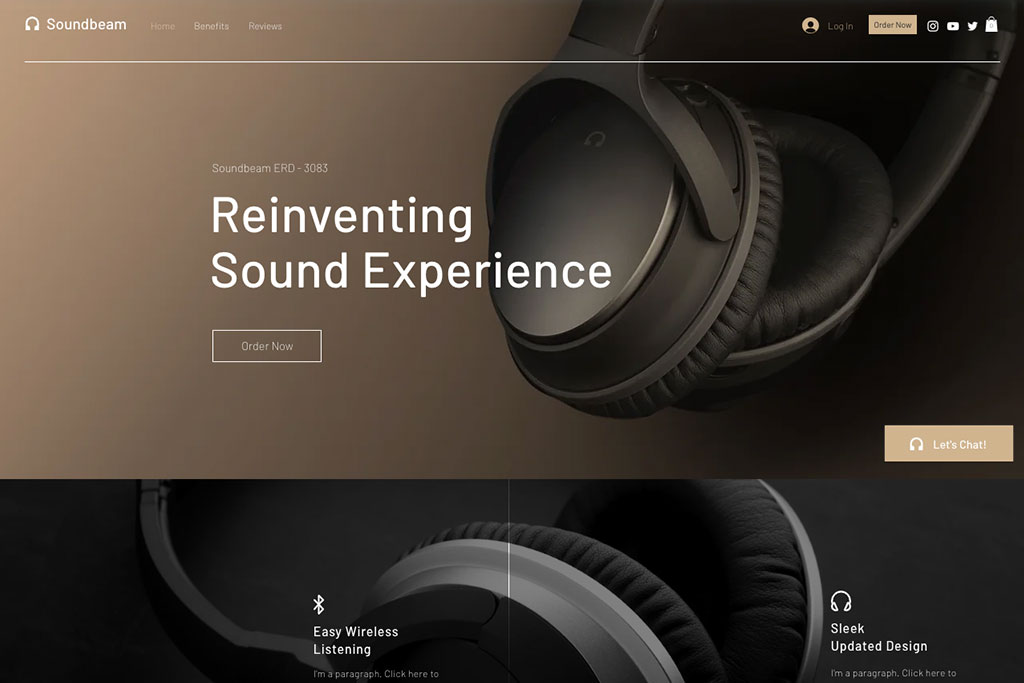
For example, imagine you search for “Best headphones for students” and click an ad. Then, you land on a page with a big headline and an image of headphones. It says you can get a 20% discount. The page also shows what the headphones can do, their warranties, and what others think about them.
What is the difference between a campaign page and a home page?
Website home pages give information, campaign pages make people take action. More visitors leave home pages than campaign pages. Why? Home pages are about comparing products, but campaign pages make people buy a specific product.
Here is how they are different:
Campaign Pages:
- Have one clear thing to do (CTA)
- Hide distracting site navigation
- Focus on one goal
- Tell about a specific product
- Useful for sponsored search results on Google (Paid traffic)
Home Pages:
- Can have many things to do (CTA)
- Show site navigation and categories
- Have general information for everyone
- Include product information and recommendations
- Useful for general search results on Google (Organic traffic)
3 Website design tips for a campaign page
1. Less Mess
Firstly, you do not want to lose a sale because the visitor felt confused by too many words or could not find the “Buy Now” button. Here are some ideas to help keep a campaign page neat:
- Short and clear headlines
- Easy-to-see and understand buttons
- Take out links that take you away
- Use quality images
- Bullet points for product information
2. Clear call to action button (CTA)
Next, show what you are giving and what people should do easily. Try different ways to show the CTA button on your website:
- Put the button at the top of the page, before you scroll down
- Have more than one button for the same action on different parts of the page
- Use words that make you want to do something (like “Sign up for Free”)
- Make people feel like they need to act fast (like “Get Your Offer Now”)
3. Quality images
Lastly, use images on your website that show what you are offering. Makes sure the image works well when viewed on desktop and phone. Here are some ways you can show that other people like your product using images:
- Testimonies from customers along with their pictures
- Pictures of people using the product you’re offering
- Show logos of famous places that talked about the product (like “As Seen on…”)
- Celebrity or influencers showing they like your product with their pictures
Start seeing results from your campaign page
Campaign pages match customers’ wants and tell them what to do next. They have engaging headlines, great images, short descriptions, and proof that others like the product, such as reviews. All of this makes customers feel sure to click the button to buy. Reach out to Eclipse Graphics to apply these tips from the article for the success of your campaign page.
Source: Big Commerce
Image Source: Wix